| View previous topic :: View next topic |
| Author |
Topic : "Chick with FutureBike WIP" |
neff
member
Member #
Joined: 11 May 2002
Posts: 1444
Location: Germany
|
 Posted: Mon Jan 06, 2003 6:50 am Posted: Mon Jan 06, 2003 6:50 am |
 |
 |

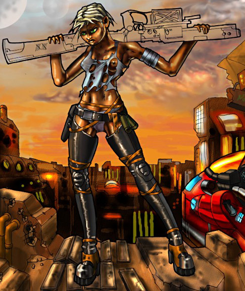
Only a rough Sketch, could someone tell me the anatomyprobs?
_________________
*
 |
|
| Back to top |
|
robust
junior member
Member #
Joined: 12 May 2001
Posts: 37
Location: Sweden
|
| Posted: Mon Jan 06, 2003 5:11 pm |
|
|
Would just like to say , good piece.
There's to things that came to my attention when I glanced on your picture, HER FACE IS SCARY  please try to change it , i think it doesnt hold the same quality as the other parts of the picture, and the legs seem to be to long and wide .. or is it just me ? please try to change it , i think it doesnt hold the same quality as the other parts of the picture, and the legs seem to be to long and wide .. or is it just me ?
Well well , would love to see the picture finished keep it up.
_________________
"Remember , the master has been an apprentice also." |
|
| Back to top |
|
neff
member
Member #
Joined: 11 May 2002
Posts: 1444
Location: Germany
|
| Posted: Tue Jan 07, 2003 6:16 am |
|
|
Ehrm, i'll fix the face, the newer version now with _more_ stuff

_________________
*
|
|
| Back to top |
|
AndyT
member
Member #
Joined: 24 Mar 2002
Posts: 1545
Location: Germany
|
| Posted: Tue Jan 07, 2003 8:27 am |
|
|
WOW great 
I didn't expect such an improvement.
Maybe it would help to move the head of the woman in the background down and to the left?
Don't know.
Can't wait to see the next version.
_________________
http://www.conceptworld.org |
|
| Back to top |
|
neff
member
Member #
Joined: 11 May 2002
Posts: 1444
Location: Germany
|
| Posted: Tue Jan 07, 2003 9:02 am |
|
|

Yes, the head, i'll try to fix the problem, hav allready begun to colorize it...
_________________
*
|
|
| Back to top |
|
AndyT
member
Member #
Joined: 24 Mar 2002
Posts: 1545
Location: Germany
|
| Posted: Tue Jan 07, 2003 9:12 am |
|
|

I almost didn't have to wait. Hehe.
OMG the sky looks GREAT!!!
_________________
http://www.conceptworld.org |
|
| Back to top |
|
Simoom
member
Member #
Joined: 18 Aug 2002
Posts: 302
Location: nc, usa
|
| Posted: Tue Jan 07, 2003 3:01 pm |
|
|
| adding the coloring was certainly a big upgrade. the chicks face still seems a bit wide. the chick in the backgrounds head seems to be turned a bit too much as well, sorta like what andy was saying. it looks a bit dislocated. good job with the coloring so far though, keep going. |
|
| Back to top |
|
neff
member
Member #
Joined: 11 May 2002
Posts: 1444
Location: Germany
|
| Posted: Wed Jan 08, 2003 10:27 am |
|
|

k, have begun teh first bike 
_________________
*
|
|
| Back to top |
|
oDD
member
Member #
Joined: 07 May 2002
Posts: 1000
Location: Wroclaw Poland
|
| Posted: Wed Jan 08, 2003 12:39 pm |
|
|
yeah youre making big improvements dude . Change the face as andy told you. i like the colors. In the future - if i can suggest something - try to study diferences in the face that seperate male from female.
_________________
portfolio | art blog |
|
| Back to top |
|
Mr. Heiesuke Oda
junior member
Member #
Joined: 16 Feb 2002
Posts: 29
Location: New York now California
|
| Posted: Thu Jan 09, 2003 7:59 am |
|
|
dude this is awesome the colors have dramatically altered the look of the peice..keep goin!!!
_________________
Art is the expression of your soul! |
|
| Back to top |
|
neff
member
Member #
Joined: 11 May 2002
Posts: 1444
Location: Germany
|
| Posted: Thu Jan 09, 2003 9:10 am |
|
|
Thanks!
Hope i'll finishing it sometime, phh

_________________
*
|
|
| Back to top |
|
AndyT
member
Member #
Joined: 24 Mar 2002
Posts: 1545
Location: Germany
|
| Posted: Thu Jan 09, 2003 2:33 pm |
|
|
I like how you did the hair and the clothing / boots.
But I'm not so sure about the skin. It seems as if it's made up of highlights and shadows only. I'd paint over the skin areas with a midtone color and a low opacity brush. (My English sucks ... but I don't know how to say it in German either)
| Quote: |
| Hope i'll finishing it sometime, phh |
Keep it up! It's gonna be worth it
_________________
http://www.conceptworld.org |
|
| Back to top |
|
neff
member
Member #
Joined: 11 May 2002
Posts: 1444
Location: Germany
|
| Posted: Fri Jan 10, 2003 4:44 am |
|
|
thank you for comments, i tried to get a dirty sunbrowned(?)
look on thet skin, but i'll paint some middletones over it like you said
_________________
*
|
|
| Back to top |
|
eyalyab
member
Member #
Joined: 11 Jan 2003
Posts: 308
Location: Israel
|
| Posted: Sat Jan 11, 2003 5:09 pm |
|
|
fix the arms/wrist/palm/fingers. the arms look too short. her right one anyways. the arm doesnt become thinner near the wrist on her left arm. plus it seems like she has no wrist there (even though you tried to hide it behind the part she's holding. fingers need work. usually when you hold something the way she is the fingertips get closer to eachother rather than apart from eachother.
there is a disturbing bright light on her right thigh near the place the 'sun dont shine'. it should be dark, or if you want the light there, then add it on the boot directly underneath it too all the way down.
i usually like it more when you erase the outlines after you color it, but this came out neat. on the other hand, you can make the outlines thinner where there is light right near them and thicker where there is shade.
great job overall |
|
| Back to top |
|
Kingofcups
junior member
Member #
Joined: 07 Jan 2003
Posts: 19
Location: A Canadian in the UK!
|
| Posted: Sun Jan 12, 2003 2:18 pm |
|
|
Overall realy nice. The character design and detail is good.
- depth fade the background and the characters will stand out a lot more.
- the main character: her jaw looks a bit weak. Left leg looks to be at slightly the wrong angle. Hands - should we see the tops of her thumbs poking out?
_________________
"Let your plans be dark and as impenetrable as night, and when you move, fall like a thunderbolt.
- Sun Tzu, The Art of War |
|
| Back to top |
|
neff
member
Member #
Joined: 11 May 2002
Posts: 1444
Location: Germany
|
| Posted: Mon Jan 13, 2003 4:51 am |
|
|
Thank you Eye, but i think its too late for such fixes , but i'll do it better next time
_________________
*
|
|
| Back to top |
|
Lightbringer
junior member
Member #
Joined: 23 Apr 2002
Posts: 20
Location: Austin, TX
|
| Posted: Wed Jan 15, 2003 4:08 am |
|
|
Overall I like the composition and I know it is a bit too late to change major parts of the anatomy, but her hips are almost non existent and her crotch appears to be located more in what should be the abdomen area. Additionally the line defining the left side of her torso is headed at a slight outward angle to the left and is then covered by the shirt, but the rest of her torso is leaning back and to the right. This give the lower portion of her torso beneath her breasts a thick/distended appearance. Moving the black line beneath her torn shirt on the left side slightly inward (towards the right) will help her proportions and stance look better.
No crits on the figure to the right side.
I love the "magic hour" color scheme you've chosen for the painting. I also like the shading technique you appear to be going with. It gives everything an oily, slick, boy is it hot out here kinda feel and accentuates the hi-tech/low-tech theme.
Overall it is shaping up to be a nice dystopian future pic. I'm looking forward to seeing it finished. |
|
| Back to top |
|
neff
member
Member #
Joined: 11 May 2002
Posts: 1444
Location: Germany
|
| Posted: Wed Jan 15, 2003 4:56 am |
|
|
Wow, ehrm, my english isnt that good, perhaps you could simply do an overpaint to show me the lines you would change? That would be great!
_________________
*
|
|
| Back to top |
|
Lightbringer
junior member
Member #
Joined: 23 Apr 2002
Posts: 20
Location: Austin, TX
|
| Posted: Wed Jan 15, 2003 7:27 am |
|
|
Ok I'll give it a shot. Basically there are two very subtle small things that distract me.
In the circled area the line of the left side of her belly angles to the left like the red line I added does. This is the same direction as the line off her rear end. This makes her torso look odd.
Then her crotch (to me) seems a bit high, but that might just be an optical illusion with the low riding belt. Still I drew a line where it looks to me that her crotch should be dropped down a bit.
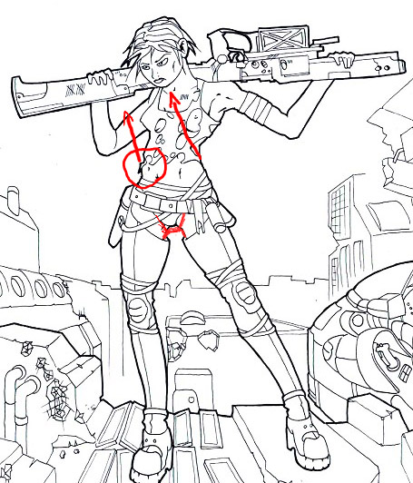
Here's a paintover changing the two things i mentioned:
You can see sky between her shirt and her belly there and I think that combined with lowering the joining of her legs makes the hip area less distracting.
I apologize if it seems like two very small things, but that's where my eyes kept getting stuck in the painting.
I hope I didn't insult you with these minor changes. I really do like where the painting is going and look forward to seeing it in the finished gallery. |
|
| Back to top |
|
neff
member
Member #
Joined: 11 May 2002
Posts: 1444
Location: Germany
|
| Posted: Wed Jan 15, 2003 8:36 am |
|
|
Thank you! Did a little update finally )

_________________
*
|
|
| Back to top |
|
|


