| View previous topic :: View next topic |
| Author |
Topic : "L A G O O N" |
Malachi Maloney
member
Member #
Joined: 16 Oct 2001
Posts: 942
Location: Arizona
|
 Posted: Wed Nov 27, 2002 8:20 am Posted: Wed Nov 27, 2002 8:20 am |
 |
 |
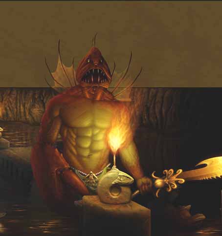
Hey everyone,
A little something different from yours truly...
I wanted to do something with a fantasy theme as I'm trying to bulk up my portfolio in an attempt to snag more clients.
Anyway, this was originally intended to be a much larger painting. It started off with another subject in it, much larger background..... All kinds of stuff. I'd been working on this for the last tree months in between other paintings and the prospect of spending another tree months on this puppy just didn't sound appealing to me. So, I trimmed down the size of the background, focused on the main subject and finally added some design elements to try and hold it all together. I personally dig this piece and it really gets me excited at the thought of doing more of this type of stuff. You'll have to let me know what you folks think.
On with the show.....
"Lagoon"

Painted freehand in Photoshop on a 9x12 Wacom tablet.
Go HERE to check out a work in progress thread for this painting.
Go HERE to get a closer look at this painting.
Go HERE to view some full resolution details from this painting.
Let me know your thoughts. 
Malachi
_________________
l i q u i d w e r x |
|
| Back to top |
|
Germ01
member
Member #
Joined: 06 Aug 2001
Posts: 197
Location: Montreal, Canada
|
| Posted: Wed Nov 27, 2002 9:07 am |
|
|
Great piece as usual! As far as crits go I'm not too sure about the letter box effect, I find it doesn't really work here. instead I would take them out. However keep the same composition you have going right now. Just crop the bottom where you put the original. Something sort of to this effect: (Hope you don't mind)
I also boosted the brightness as you have some really great elements in there and that you should really show them off! As for the top part continue with cave in the background (it should'nt take that much more time to do  ) One last thing, on the creatures face perhaps play with the lighting a little more, make it as if he put a flashlight under his chin,(we all used to that when we were kids) and then you get those really cool scary highlights happening. Once again GREAT work! I can't wait to see more fantasy illustrations from you! ) One last thing, on the creatures face perhaps play with the lighting a little more, make it as if he put a flashlight under his chin,(we all used to that when we were kids) and then you get those really cool scary highlights happening. Once again GREAT work! I can't wait to see more fantasy illustrations from you!
_________________
It's better to have something and not need it, then to need it and not have it. |
|
| Back to top |
|
liv the fish
member
Member #
Joined: 26 Jan 2002
Posts: 83
Location: Kentucky
|
| Posted: Wed Nov 27, 2002 10:25 am |
|
|
I have a few "I'd do this differently" comments, but I'd like to first state that the rendering and color scheme is extremely well executed.
I don't agree with Germ about lightening the image though. The lighting creates a certain mood that'd be destroyed by lightening it. What I'd do instead is intensify the highlights. Torch or candle light (small lights) in absence of other light creates really sharp lights and shadows. I'd play up the contrast some more to intensify the mood. Lightening it would only weaken the scarey monster effect.
I do agree with Germ about cropping it though (of which Germ said plenty)
The composition needs a bit of work. The focus is supposed to be on the monster, but you have the sword (which is really cool btw) pointing away and off the canvas. Its distracting to the eye. This sort of composition works if there's literal movement in the image and the eye is supposed to feel that motion. But this image is static, so the effect should be focusing the eye on the main subject.
Last thing, there's a tangent from the wall that cuts off the monster's head. Drop or raise it. I'm thinking around the shoulders would be better.
Anywho, despite a few problems, it'll still look great in your portfolio.
good luck,
Brian
_________________
*This space for sale* |
|
| Back to top |
|
Mykoz
member
Member #
Joined: 14 Jun 2002
Posts: 148
Location: Belgium
|
|
| Back to top |
|
UkiTakuMuki
member
Member #
Joined: 20 Nov 2002
Posts: 156
|
| Posted: Wed Nov 27, 2002 4:40 pm |
|
|
... /me dies
The scales..and the knife.. and ..and the Tendons WOW
seriously man... that is just sweet!!!
At first i took one look at the fishman and i said "meh, fish." then ilooed closer and after u noted the high-definition shots... and i am still stunned :> Even if i dislike such mutated fantasy setting, but still.. your work really inspires!!!
You could have draw one of your awesome women next to him too :> that would have been great.
Regards |
|
| Back to top |
|
Matthew
member
Member #
Joined: 05 Oct 2002
Posts: 3784
Location: I am out of here for good
|
| Posted: Fri Nov 29, 2002 5:46 am |
|
|
Hello. Your coloring tecnique just rocks! 
Matthew |
|
| Back to top |
|
Malachi Maloney
member
Member #
Joined: 16 Oct 2001
Posts: 942
Location: Arizona
|
| Posted: Fri Nov 29, 2002 8:02 am |
|
|
Thanks for the feedback folks. Much appreciated.
For those of you who thought the design elements were a little weak.....
Yea, I thought it looked a little off, but I didn't really know what it was. I didn't want to do any more painting on this piece, so I tried to think of a way to make the design a little stronger in hopes it would succeed in pulling things together this time.
I didn't make any big changes, but I think what I've done did help a lot. You'll have to let me know what you guys think.
Here's the update:

Malachi
_________________
l i q u i d w e r x |
|
| Back to top |
|
Matthew
member
Member #
Joined: 05 Oct 2002
Posts: 3784
Location: I am out of here for good
|
| Posted: Fri Nov 29, 2002 9:37 am |
|
|
Hello, it got even better. Those Strokes helped the Perspective a hole lot.
Matthew |
|
| Back to top |
|
[666]Flat
member
Member #
Joined: 18 Mar 2001
Posts: 1545
Location: FRANKFURT, Germany
|
| Posted: Fri Nov 29, 2002 10:22 am |
|
|
CRAAAAAZAAAAY. Damn, you're good.
_________________
 |
|
| Back to top |
|
Malachi Maloney
member
Member #
Joined: 16 Oct 2001
Posts: 942
Location: Arizona
|
|
| Back to top |
|
|


