 |
|
 |
| View previous topic :: View next topic |
| Author |
Topic : "The Messenger" |
Germ01
member
Member #
Joined: 06 Aug 2001
Posts: 197
Location: Montreal, Canada
|
 Posted: Mon Oct 14, 2002 5:40 pm Posted: Mon Oct 14, 2002 5:40 pm |
 |
 |
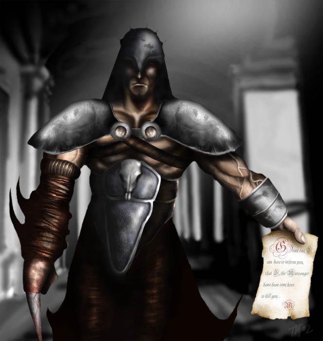
This was something I have been working on for a few nights now and I just finished. Ref was used for the background. C&C is more than welcomed. Thanks for looking!
 |
|
| Back to top |
|
Bare Bonez
member
Member #
Joined: 06 Jun 2000
Posts: 248
Location: North York
|
| Posted: Mon Oct 14, 2002 6:43 pm |
|
|
Good job and great start.
I really dig the texturing you've done on the armour. It's very realistic. Also the amount of detail in the clothing and arm (damn those are big viens) shows a lot of hard work and attention to detail was put into this. You should be proud of this. The anatomy also looks correct.
However, there are still areas of improvement. The helmet lacks the detail of the shoulder pads, so I looks a little undone. The lighting seems inconsistent. If light is coming from above and to the right, the left shoulder pad, shouldn't be that bright. Also the bracer shouldn't have the forward light. I think that's the reason why the shoulder pads don't look like they're apart of the guy.
I just checked out your site and I think your "Beauty and the Beast" picture shows consistent lighting (btw, great picture  ). ).
Anyway, these are just my opinions. My biggest flaw most of the time is inconsistent lighting. You've got a really good thing going here. Just tweak the lighting a bit and I it'll look more complete. Good job! |
|
| Back to top |
|
Germ01
member
Member #
Joined: 06 Aug 2001
Posts: 197
Location: Montreal, Canada
|
| Posted: Tue Oct 15, 2002 9:06 am |
|
|
| Hey thanks for the great critique! As soon as I find some time I will make those lighting changes. Its funny, lighting could either make or brake a picture. Thanks again! |
|
| Back to top |
|
J. Der
junior member
Member #
Joined: 25 Aug 2002
Posts: 27
Location: Montreal, Canada
|
| Posted: Tue Oct 15, 2002 9:24 am |
|
|
Hey Germ,
First of all, nice to see a fellow Montrealer 'round these parts ^_^. Do you go to school here as well?
This is a piece that shows that you have all the skills needed to be very successful. This work of yours shows a good grip of anatomy, texture, and the willingness to go the extra mile to add polish to your work. It's just a matter of putting everything together in a tight package and you'll be cocked and ready to rock (did I just say that?!).
Here are a few things I noticed.
-Like it was said above, the lighting could stand to be tweaked a bit, try working from an single angled lightsource so things don't look so forward and random (If you know what I mean).
-I would paint over one of the shoulder-plates (is that what they're called), it appears that you've copy and pasted to save time on doing the other, and it kinda cheapens the whole piece. I must admit, you've god yourself a fantastic texture going.
-Perhaps you could go even further the add scratches to the armor? Especially in the helmet and chestplate? They're very simple and reap major benefits, even more polish. All you have to do to make a scratch is take the burn tool, make a scratch across the metal with it, then take the dodge tool and lighten the edge of the scratch where the lighting would hit it.
-His left arm seems a little flat, I would highlight the left bicep a little more, as the veins pop out a little too much to look realistic.
-Maybe sharpen up the face to give a more evil appeal?
I'm just nitpicking mind you. You've got some great ideas here. I love the right "arm", the texture on the wrapping is fantastic, it would be great to see more twisted stuff like that carried over onto other portions of your characters body.
Keep up the great work! Let's see some more!
-JD
- |
|
| Back to top |
|
|
|
You cannot post new topics in this forum
You cannot reply to topics in this forum
You cannot edit your posts in this forum
You cannot delete your posts in this forum
You cannot vote in polls in this forum
|
|
Powered by phpBB © 2005 phpBB Group
|


