| View previous topic :: View next topic |
| Author |
Topic : "Harley Quinn (remember joker's sidekick?)" |
J. Tsang
member
Member #
Joined: 17 Sep 2001
Posts: 62
Location: Toronto
|
 Posted: Wed May 01, 2002 7:58 am Posted: Wed May 01, 2002 7:58 am |
 |
 |
c&c welcome
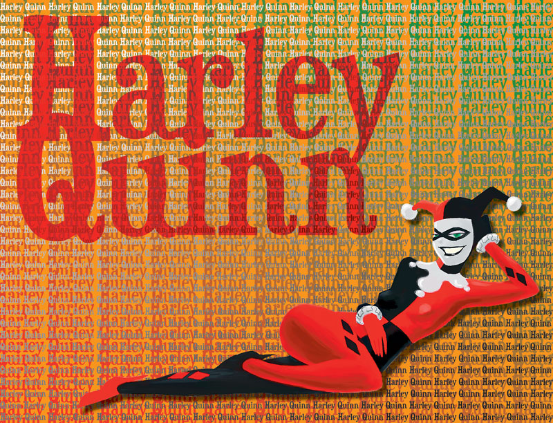
thks |
|
| Back to top |
|
Loki
member
Member #
Joined: 12 Jan 2000
Posts: 1321
Location: Wellington, New Zealand
|
| Posted: Wed May 01, 2002 8:02 am |
|
|
Haha - that's slick! Very nice style. Love the expression on the face. You might want to fix the shading under the arm and on the right boobie.
While you're at it, you could even give the suit some more shinyness - but I don't know if you want that. Neat. |
|
| Back to top |
|
iByrn
member
Member #
Joined: 14 Mar 2002
Posts: 131
Location: Minnesota
|
| Posted: Wed May 01, 2002 7:55 pm |
|
|
Her boobs are sagging...  |
|
| Back to top |
|
DarkVVulf
member
Member #
Joined: 27 Nov 1999
Posts: 201
Location: CO
|
| Posted: Wed May 01, 2002 8:16 pm |
|
|
I love that expression on her face.
But yeah, her breasts are a little droopy for a woman so young. |
|
| Back to top |
|
faeklone
member
Member #
Joined: 03 Apr 2002
Posts: 215
Location: Calgary
|
| Posted: Wed May 01, 2002 11:55 pm |
|
|
The black side is droopy, the other side is perky.
Are you going to add more shade to the pic or is it pretty much done in your eyes? I would like to see it done with more shade, especially in the black. And maybe smooth out the shading in the red a little more.
Anyway, just adding my two cents. |
|
| Back to top |
|
J. Tsang
member
Member #
Joined: 17 Sep 2001
Posts: 62
Location: Toronto
|
| Posted: Thu May 02, 2002 7:29 am |
|
|
thks for the great comments
i'll work on it again later. |
|
| Back to top |
|
saladbowl
member
Member #
Joined: 15 Mar 2002
Posts: 249
Location: PA, USA
|
| Posted: Thu May 02, 2002 2:51 pm |
|
|
Hmmm...yeah...I like it..., even though she was a lot hotter in the show!  |
|
| Back to top |
|
Dedalus
junior member
Member #
Joined: 19 Jan 2001
Posts: 22
Location: Canada
|
| Posted: Thu May 02, 2002 5:22 pm |
|
|
Very nice expression and pose as eveyone has told you. Her suit could use some stronger highlights I think.
I must say thought that background is just way too much. It's just too busy, I understand that is part of Quinn's character but try to tone in down a bit so it doesnt have so much contrast. My 2 cents. Keep up the good stuff. |
|
| Back to top |
|
|


