| View previous topic :: View next topic |
| Author |
Topic : "Something a little different (please critique)" |
L99Relm
member
Member #
Joined: 22 Oct 2000
Posts: 123
Location: VA, USA
|
 Posted: Mon Oct 15, 2001 4:35 pm Posted: Mon Oct 15, 2001 4:35 pm |
 |
 |
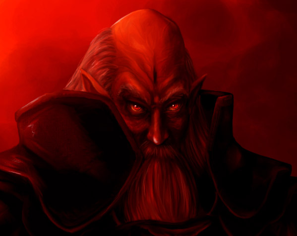
Well, this is definitely not what I usually draw...And it's my first time trying to draw anything even remotely "dark." I'd appreciated any critiques and comments I could get. Any tips on making him look more evil?

A close-up of his head...

[ October 15, 2001: Message edited by: L99Relm ] |
|
| Back to top |
|
Akolyte
member
Member #
Joined: 12 Sep 2000
Posts: 722
Location: NY/RSAD
|
| Posted: Mon Oct 15, 2001 4:40 pm |
|
|
This is cool. His nose doesn't follow the perspective of the head though. I like it  |
|
| Back to top |
|
Dryfire
member
Member #
Joined: 21 May 2000
Posts: 945
Location: Long Island, NY
|
| Posted: Mon Oct 15, 2001 5:17 pm |
|
|
| Nice, overall lighting and hue is good. hmmm I thgink you shoudl add a bit more blues though in the shadow.. remember, the warmer the light and tone of the highlights, the cooler and bluer the shadows are |
|
| Back to top |
|
Highfive
member
Member #
Joined: 08 Oct 2001
Posts: 640
Location: Brisbane, AU
|
| Posted: Mon Oct 15, 2001 5:48 pm |
|
|
Looks very sinister indeed, and his overall silhouette must look good, too.
I think the shading for the shoulder-plates isn't quite right for their shape. This pic shows what I mean for the right one  |
|
| Back to top |
|
Lukiaz
member
Member #
Joined: 02 Aug 2001
Posts: 242
Location: New Zealand
|
| Posted: Mon Oct 15, 2001 6:29 pm |
|
|
Hey a change in content(something I must do).
Definitley a different spin on your usual colourfull, light tone work.
I like it and the adjustment made by Highfive is nice. I think you should take the collar back a bit though. I don't know if you intentionally were aiming for it to obscure his face but It would look better imo if it was in the same position in relation to the other collar.
In fact the collar is far to large(*if* its supposed to be like that of the other side)....I'd give show you what I meant if I could!. maybe someone else can show you?.
Cool pic!!.  |
|
| Back to top |
|
Gothic Gerbil
member
Member #
Joined: 10 Jul 2000
Posts: 237
Location: Ooltewah, Tennessee, USA
|
| Posted: Mon Oct 15, 2001 7:33 pm |
|
|
| Rather like it, though the red is a bit rough on the eyes. I think if you added some dark blues to the shadows it would help move the eye around a bit more, give it some place to rest, not to mention help making him look more sinister. The cut of his beard is rather severe too, is it going into his armour or is it really cut off at that level? |
|
| Back to top |
|
Quasar
member
Member #
Joined: 01 Oct 2001
Posts: 355
|
| Posted: Mon Oct 15, 2001 8:04 pm |
|
|
That is awsome man seriously!!!  |
|
| Back to top |
|
Highfive
member
Member #
Joined: 08 Oct 2001
Posts: 640
Location: Brisbane, AU
|
| Posted: Mon Oct 15, 2001 8:07 pm |
|
|
Everyone get a load of this guy's eyes, aye. They're pretty freaky!
Putting the most detail in the essential bits is always good. |
|
| Back to top |
|
Shiro_tengu
member
Member #
Joined: 02 Aug 2001
Posts: 430
Location: W. Australia
|
| Posted: Mon Oct 15, 2001 8:15 pm |
|
|
Das ist sehr dunkel und schlecht. Ich liebe es.
whoops, That is very sinister and evil. I love it. I didn't think he was wearing armour though. |
|
| Back to top |
|
Radiater
member
Member #
Joined: 09 Mar 2001
Posts: 331
Location: Vancouver, B.C.
|
| Posted: Mon Oct 15, 2001 10:01 pm |
|
|
Wow L99Relm,
This is a big step away from what you normally post. I did a double take to make sure it was really your post I was looking at.
I like it. I think steping out of your normal genre has forced you to be more creative in this piece. It feels more original.
Only thing I can suggest to improve it is: maybe revisit the nose. The way you have the highlights make it look bent/turned to his right. (Looks like this was already mentioned though.)
Radiater |
|
| Back to top |
|
L99Relm
member
Member #
Joined: 22 Oct 2000
Posts: 123
Location: VA, USA
|
| Posted: Tue Oct 16, 2001 5:21 pm |
|
|
| Thanks for the helpful comments everyone. When I get the time I'll see about adding some cooler colors to the shading, fixing the highlights on his nose and shoulder plate (thank you for the illustration on that issue) and maybe the shape of the collar. *Goes back to her back to her big pile of homework..* |
|
| Back to top |
|
Davem
junior member
Member #
Joined: 16 Jul 2001
Posts: 44
Location: Australia
|
| Posted: Tue Oct 16, 2001 8:00 pm |
|
|

Its a bit rough but someone mentioned about adding blues in the shadows. I had a bit of a play (hope you dont mind L99). I dont think i got it quite right but it definitely brings out the dimension to add some secondary lighting. You could use any colour (i did it on a separate layer and had a play with the Hue & Sat.
I was't quite sure what was going on on the shoulder bars.
Dave |
|
| Back to top |
|
Akukage
member
Member #
Joined: 13 Oct 2001
Posts: 51
Location: SE Michigan
|
| Posted: Thu Oct 18, 2001 1:55 am |
|
|
| very good over all. the hair seems odd, like the (his) left side is further back than the right. and the beard does seem a little to crisp, & should look a touch fluffy, to look more natural. |
|
| Back to top |
|
Ax0
member
Member #
Joined: 21 Feb 2001
Posts: 167
Location: Finland
|
| Posted: Thu Oct 18, 2001 10:03 am |
|
|
hmm, i think the eyes should show the anger more. Suggest you go in front of a mirror and make a angry face and look up your eyes and take that as ref. for your work.
Anyways, very bloody athmospere.
*thumbs up* |
|
| Back to top |
|
L99Relm
member
Member #
Joined: 22 Oct 2000
Posts: 123
Location: VA, USA
|
| Posted: Thu Oct 18, 2001 4:32 pm |
|
|
I've tried to fix most of the things you guys have suggested. I found it hard to put blue in the shadows because they were so dark to start with...I wonder if you can see it at all. Do you think this is an improvement?
 |
|
| Back to top |
|
P diddy
junior member
Member #
Joined: 06 Mar 2001
Posts: 39
Location: oakland, ca, usa
|
| Posted: Sat Oct 20, 2001 10:44 pm |
|
|
hey there,
i like the progression that you had made. THe blue light you had in the scene initially was way too bright. i would just tone it down, (the final image almost has none of it left). the blue adds a good contrast.
one last detail you might want to do is add some white highlights. you all ready have a good image, and by placing the right amount of highlights, you picture can pop alive. don't go too crazy with it though. also, your image doesn't contain any values which are near white, so they will stand out even more.
here's a quick ver so you can see what i'm talking about.
keep up the good work.
p
 |
|
| Back to top |
|
|


