| View previous topic :: View next topic |
| Author |
Topic : "Achrom, Lord of the Sith" |
Flexible Elf
member
Member #
Joined: 01 Aug 2000
Posts: 642
Location: Parker, CO
|
 Posted: Fri Oct 05, 2001 7:35 pm Posted: Fri Oct 05, 2001 7:35 pm |
 |
 |
Hey hey hey! Welcome back sijun! It's been a little while 

This is one of the characters in the new comic strip I'm working on (done mostly in Painter and Photoshop). His name is Darth Achrom. I posted a more cartoony pic of him on Sijun a long time ago, but the strip will be a bit more chiseled and gritty. He is pure evil.
-Flexible Elf
[ October 06, 2001: Message edited by: Flexible Elf ] |
|
| Back to top |
|
sacrelicious
member
Member #
Joined: 27 Oct 2000
Posts: 1072
Location: Isla Vista, CA
|
| Posted: Fri Oct 05, 2001 7:38 pm |
|
|
| Woop woop! The Elf is in tha hizzouse! Good shiznit FE, although I must say that "Darth Archom" flows off the tongue better than "Darth Achrom". IMHO, of course. |
|
| Back to top |
|
Sonique128
junior member
Member #
Joined: 11 May 2001
Posts: 48
Location: silicon valley
|
| Posted: Fri Oct 05, 2001 7:43 pm |
|
|
| very nice piece. the cape is very mcfarlene, i like. |
|
| Back to top |
|
Briareos
member
Member #
Joined: 24 May 2001
Posts: 392
Location: CA
|
| Posted: Fri Oct 05, 2001 10:32 pm |
|
|
| Nice, can't wait to see the finished piece?? |
|
| Back to top |
|
jb
junior member
Member #
Joined: 12 Apr 2001
Posts: 14
|
| Posted: Fri Oct 05, 2001 10:37 pm |
|
|
wow, thats really cool.
Just one thingy - the bottom half of the lightsabre looks slightly out of place compared to the top half - looks a bit bent to me  |
|
| Back to top |
|
jcFIG
member
Member #
Joined: 05 Aug 2001
Posts: 189
Location: San Diego, Ca.
|
| Posted: Fri Oct 05, 2001 10:38 pm |
|
|
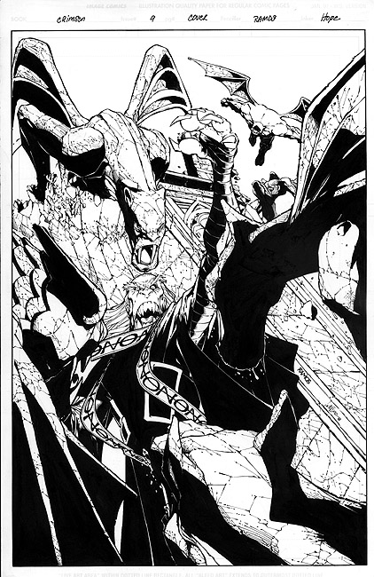
Very nicely drawn, but it looks like one of Humberto Ramos characters from his 'Crimson' comic series only you added a lightsaber. Not only that but the reason I say that is because the style you llustrated the face in is also very similar. Now don't respond the wrong way and I'm not accusing you of copying I'm just pointing out what I see
Also, I went to see your website and I would like to compliment you on some very beautiful work. Later man.
[ October 05, 2001: Message edited by: jcFIG ] |
|
| Back to top |
|
chip_artz
member
Member #
Joined: 07 Mar 2001
Posts: 92
Location: LI, NY
|
| Posted: Fri Oct 05, 2001 11:09 pm |
|
|
quote:
Originally posted by jcFIG:
Very nicely drawn, but it looks like one of Humberto Ramos characters from his 'Crimson' comic series only you added a lightsaber. Not only that but the reason I say that is because the style you llustrated the face in is also very similar. Now don't respond the wrong way and I'm not accusing you of copying I'm just pointing out what I see
[ October 05, 2001: Message edited by: jcFIG ]
I think this has a slight resemblance of Humberto but I think it has much more facial detail than Ramos ...and looks batter to me too. |
|
| Back to top |
|
Son of Cos
junior member
Member #
Joined: 05 Oct 2001
Posts: 23
Location: The pit of hell
|
| Posted: Fri Oct 05, 2001 11:14 pm |
|
|
He roxors!!!...hey jcfig do you hear whistling between your ears ya brainless dult...other then sharp teeth what else looks alike moron??? Jesus im surrounded by a bunch of freakin geniuses..why dont you crit a real artist when you get out of school lamer...
[ October 06, 2001: Message edited by: Son of Cos ] |
|
| Back to top |
|
Matt Elder
member
Member #
Joined: 15 Jan 2000
Posts: 641
Location: Sydney, NSW, Australia
|
| Posted: Fri Oct 05, 2001 11:57 pm |
|
|
| that is a very cool image. I love the dirty, gritty style. I love the way you have the head in the hood. I'm not sold on the hands though in terms of the pose. The right arm is hardly bent meaning the left arm would have to be reaching across the body. For this to happen, the left shoulder should be dropping a bit. Minor point. |
|
| Back to top |
|
Flexible Elf
member
Member #
Joined: 01 Aug 2000
Posts: 642
Location: Parker, CO
|
| Posted: Sat Oct 06, 2001 1:08 am |
|
|
sacrelicious - Hehe thanks man. Archom does sound pretty cool, but Achrom actually carries meaning.. it means 'soulless and without color'.
Sonique - Yeah I purposely spawnified his cape a little bit. I want this Sith Lord to be very Reaper-esque.. almost magical darkness to follow him wherever he goes and his cloak to be tattered and seemingly alive.
Briareos - This might be as finished as this one'll get. I have some other character sheets to do also
jb - thanks! and yeah you're right.. I fixed it in a way
jcFIG - Thanks much. To be quite honest with ya I think this pic was much more influenced by Marc Silvestri (one of my art heroes) than Humberto Ramos. I know there's a Crimson comic done by him but aside from the first comic in the series, I haven't seen any of his stuff.. not real fond of it. With that said I've never seen the shown panel before. Though I can see similarities in the cheekbones [but maybe Humberto was influenced a bit by Marc too ].. the teeth on Ramos' character are much larger and more bowed out in the middle (though yes, they are both jagged). Aside from that I don't see much in similarity except also they both are wearing long flowing robes.. but in the case of my pic, I was inspired to try to pull off a Sith/Grim Reaper/Spawn look. I also think the differences are far more substantial than 'just Ramos' character with a lightsaber added'. I'm glad you like my website stuff And I don't take offense at all.. any comparison to a pro artist in the field I take as a compliment.
chip_artz - Thanks! I appreciate that immensely.
Son of Cos - Thanks man, it's ok I didn't take offense.. the similarity was enough to merit the link to the pic.. I've just never seen it before is all.
Matt - you and jb are definitely right. I fixed it in a way
-Flexible Elf |
|
| Back to top |
|
geoman2k
member
Member #
Joined: 26 Apr 2001
Posts: 375
Location: Indiana
|
| Posted: Sat Oct 06, 2001 3:49 am |
|
|
nice work man... where the hell have you beed lately? haven't seen you in paintchat at all forweeks
keep it up |
|
| Back to top |
|
Shiro_tengu
member
Member #
Joined: 02 Aug 2001
Posts: 430
Location: W. Australia
|
| Posted: Sat Oct 06, 2001 3:56 am |
|
|
| I really like this piece. He looks seriously evil. Who will be good enough to fight him? |
|
| Back to top |
|
Ian Jones
member
Member #
Joined: 01 Oct 2001
Posts: 1114
Location: Brisbane, QLD, Australia.
|
| Posted: Sat Oct 06, 2001 7:55 am |
|
|
WoW! thats cool.
Very Dynamic. Great composition. Great 'gritty' sorta stlye. It will look awesome as a comic. |
|
| Back to top |
|
Jezebel
member
Member #
Joined: 02 Nov 2000
Posts: 1940
Location: Mesquite, TX, US
|
| Posted: Sat Oct 06, 2001 8:13 am |
|
|
| Damn you Flex...!! ^_^ |
|
| Back to top |
|
Jaymo
member
Member #
Joined: 14 Sep 2000
Posts: 498
Location: Saarbr�cken, Germany
|
| Posted: Sat Oct 06, 2001 8:47 am |
|
|
Wheee, nice pic, flex! Love it.
Two things though:
- the "blade" appears to be at a slightly different angle than the handle.
- the bright glowing blade could shed a little more light on the figure instead of a reddish and faint glow, esp. in areas very close to the blade. On the face this may be okay though, in order to maintain the nice color scheme.
Nice work again! |
|
| Back to top |
|
Anthony
member
Member #
Joined: 13 Apr 2000
Posts: 1577
Location: Winter Park, FLA
|
| Posted: Sat Oct 06, 2001 8:57 am |
|
|
| Hey, welcome back. I feel like I wanna see some dark ocre in there-but dang, Obiwan's not gonna stand a chance. ^_^ |
|
| Back to top |
|
jcFIG
member
Member #
Joined: 05 Aug 2001
Posts: 189
Location: San Diego, Ca.
|
| Posted: Sat Oct 06, 2001 10:04 am |
|
|
quote:
Originally posted by Son of Cos:
He roxors!!!...hey jcfig do you hear whistling between your ears ya brainless dult...other then sharp teeth what else looks alike moron??? Jesus im surrounded by a bunch of freakin geniuses..why dont you crit a real artist when you get out of school lamer...
[ October 06, 2001: Message edited by: Son of Cos ]
Its funny that a fool named 'Son of Cos' makes it a point to single me out because he didn't like my opinion. Even the artist himself didn't take offense because he knew what I meant. 'Son of Cos', my opinion is just that and I spoke my mind, I don't water it down for hypersensitive pansies like you. Go cry a river somewhere else. |
|
| Back to top |
|
jcterminal
member
Member #
Joined: 13 Nov 2000
Posts: 316
Location: Vault 13
|
| Posted: Sat Oct 06, 2001 2:21 pm |
|
|
excellent work once again elf. that just plain kicks ass. if a whole comic was done like that, i'd buy it for sure.
keep up the good work:
son of cos, jcFIG: your opinions are all fine and good, but please, take it elsewhere. don't pollute the forum. thanks. |
|
| Back to top |
|
Akolyte
member
Member #
Joined: 12 Sep 2000
Posts: 722
Location: NY/RSAD
|
| Posted: Sat Oct 06, 2001 2:29 pm |
|
|
Hehe, Flex Elf graces the hallowed walls of sijun once again  Kick ass piece Flexy, I love the teeth. Saber looks sweet too. Kick ass piece Flexy, I love the teeth. Saber looks sweet too.
Don't create a disturbance in the force in this thread people, not wanted here. |
|
| Back to top |
|
Cos
member
Member #
Joined: 05 Mar 2000
Posts: 1332
Location: UK
|
| Posted: Sat Oct 06, 2001 5:23 pm |
|
|
Son of Cos - that bitch Chris Perry a.k.a. Mongoose a.k.a HumanClay a.k.a Milkman a.k.a Simuartist returns.. I spot you a mile away. Hows things? still ripping off peoples artwork? Hope thats going well for you heh. Sad to see you still haven't found better things to do with your time than make new aliases and start flames or kiss arse on sijun forum. Maybe it's time you found a life you sad sad loser
Flex - Don't want to kick off flames in your thread but this bitch was asking for it. Great piece, I look forward to seeing the strip you're working on =)
[ October 06, 2001: Message edited by: Cos ] |
|
| Back to top |
|
geoman2k
member
Member #
Joined: 26 Apr 2001
Posts: 375
Location: Indiana
|
| Posted: Sat Oct 06, 2001 11:12 pm |
|
|
quote:
Originally posted by Shiro_tengu:
I really like this piece. He looks seriously evil. Who will be good enough to fight him?
me. |
|
| Back to top |
|
FireFry
member
Member #
Joined: 18 Jul 2001
Posts: 226
Location: California, USA
|
| Posted: Sat Oct 06, 2001 11:31 pm |
|
|
| Man thats awesome. More! More! |
|
| Back to top |
|
Flexible Elf
member
Member #
Joined: 01 Aug 2000
Posts: 642
Location: Parker, CO
|
| Posted: Sun Oct 07, 2001 5:17 pm |
|
|
geoman - I've been real busy with stuff. I keep stopping by paintchat but aint nobody in there when I check.
Shiro_tengu - Hehe, somebody willing to make the ultimate sacrifice
Ian - Thanks! I sure hope so
Jezebel - Where's the love?
Jaymo - I might have tapered it too short on one end. As for the lighting I didn't want to get too carried away and ruin the mood with a lot of bright ambient red light. So I sacrificed a bit of realism.
Anthony - Obi-Wan'd do best to run and be a hermit early before tangling horns with Achrom
jcFIG - Can't we all just get along?
geoman2k - Yer gunna need sum help son..
FireFry - Hehe I'm workin on it.. thanks!
jcterminal - That's one of the highest compliments I've ever been given. Thanks much
Ak - You're everywhere!
Cos - It'll be ok.. I just need to go get a fire extinguisher.
-Flexible Elf |
|
| Back to top |
|
Flexible Elf
member
Member #
Joined: 01 Aug 2000
Posts: 642
Location: Parker, CO
|
| Posted: Mon Oct 08, 2001 11:34 pm |
|
|
wow BG.. that's a great idea with that backlighting.. it really makes the foreground sabre light real spooky. That's shweet!!
In terms of my color choice I wanted it to be real bereft of color because of the nature of this particular Sith Lord. That and I did it pretty quickly I just wanted to lay down a character sheet/sketch of Achrom before I started my comic. I need to get some more done too now that I have a little time.
-Flexible Elf |
|
| Back to top |
|
Bg
member
Member #
Joined: 20 Jan 2000
Posts: 675
Location: Finland
|
| Posted: Mon Oct 08, 2001 11:49 pm |
|
|
Hey Flex!! Really nice to see you, it must be 2 or 3 months since I last talked to you.
The drawing is excellent as always and I don't have any crits for it. Is there a reason for the limited (B&W + red) palette? If not then I say it really could use some additional colours. The other thing I noticed is the shading, it looks kinda flat in my opinion, with a few simple strokes you could achieve a great amount of depth... I tried to illustrate those things (the fact is I couldn't keep my hands away of your pic, sorry ) :  |
|
| Back to top |
|
Incubus
member
Member #
Joined: 27 Oct 2000
Posts: 59
Location: Germany
|
| Posted: Tue Oct 09, 2001 5:41 am |
|
|
| I just love this pic! Personally, I like this greyscale-with-red-in-it-style. Pure evil! Why didn�t Darth maul look like that?!? |
|
| Back to top |
|
|


