| View previous topic :: View next topic |
| Author |
Topic : "painting of a ghost" |
J. Tsang
member
Member #
Joined: 17 Sep 2001
Posts: 62
Location: Toronto
|
 Posted: Sat Jul 06, 2002 1:15 am Posted: Sat Jul 06, 2002 1:15 am |
 |
 |
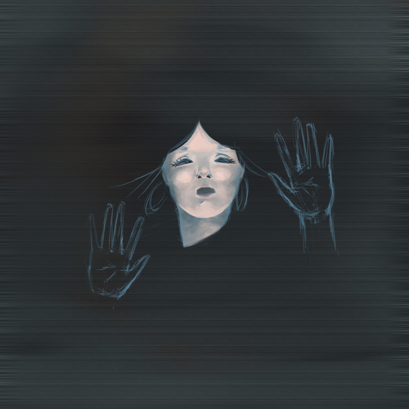
just started this one tonite.
basically it's just a ghost who is trapped behind a big black box and wanted to break out.
i've no idea why i came up with this idea. i just feel like drawing it.

so pls tell me if anything's wrong about the image, anything that you dont like or anything that doesn't look right to you. thank you |
|
| Back to top |
|
neff
member
Member #
Joined: 11 May 2002
Posts: 1444
Location: Germany
|
 Posted: Sat Jul 06, 2002 2:14 am Posted: Sat Jul 06, 2002 2:14 am |
 |
 |
| idea --> 13 Ghosts ? |
|
| Back to top |
|
J. Tsang
member
Member #
Joined: 17 Sep 2001
Posts: 62
Location: Toronto
|
 Posted: Sat Jul 06, 2002 9:03 am Posted: Sat Jul 06, 2002 9:03 am |
 |
 |
| 13 ghosts? wat is that? i've never heard of it. |
|
| Back to top |
|
Guy-Incognito
member
Member #
Joined: 21 Feb 2002
Posts: 147
Location: UK
|
 Posted: Sat Jul 06, 2002 10:36 am Posted: Sat Jul 06, 2002 10:36 am |
 |
 |
I would check the size of her hands before going much further. Everybody�s hand is the same size as their face (from chin to eyebrow) and her hands look a little too big.
I quite like her expression. Hopefully you can add that ghostly feel once your happy with the structure of the drawing.
keep it up. |
|
| Back to top |
|
EviLToYLeT
member
Member #
Joined: 09 Aug 2000
Posts: 1216
Location: CA, USA
|
 Posted: Sat Jul 06, 2002 10:40 am Posted: Sat Jul 06, 2002 10:40 am |
 |
 |
ilooks good... one thing you could do to make it more ghost like is paint it full vibrant colors on one layer and then just adjust the opcity at the end.might work  |
|
| Back to top |
|
J. Tsang
member
Member #
Joined: 17 Sep 2001
Posts: 62
Location: Toronto
|
 Posted: Sun Jul 07, 2002 8:52 am Posted: Sun Jul 07, 2002 8:52 am |
 |
 |
thks for the great input guys
so you notice that the hand is a not in proportion. actually what i wanted it to look like is the hand is closer to the viewer than the face. but i guess i fail to do so. i'll have to find a way to fix that.
can you explain a little more about vibrant color? what is it? sorry, but i really dont know.
thks |
|
| Back to top |
|
J. Tsang
member
Member #
Joined: 17 Sep 2001
Posts: 62
Location: Toronto
|
 Posted: Sun Jul 07, 2002 9:53 am Posted: Sun Jul 07, 2002 9:53 am |
 |
 |
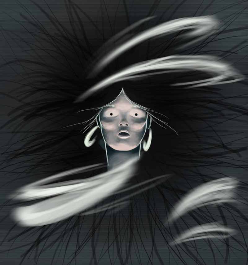
here is the updated version:

pls point out where there is anything wrong
i've excluded the hands coz i found it too disextrating.
about the eyes, does anyone have any other suggestions?
thks |
|
| Back to top |
|
Guy-Incognito
member
Member #
Joined: 21 Feb 2002
Posts: 147
Location: UK
|
 Posted: Sun Jul 07, 2002 10:30 am Posted: Sun Jul 07, 2002 10:30 am |
 |
 |
This is much better. Is she still behind glass? There is a much more ghostly feel to her now. If I were to grumble about something, it would be the grainy horizontal lines in the background. As a suggestion, how about faint (spooky) tree silhouettes in the moonlight? The trick would be trying to avoid making it look cheesy! I think it would be worth it though.
Perhaps that could be too distracting though. hmm...............................
[ July 07, 2002: Message edited by: Guy-Incognito ] |
|
| Back to top |
|
J. Tsang
member
Member #
Joined: 17 Sep 2001
Posts: 62
Location: Toronto
|
 Posted: Sun Jul 07, 2002 1:31 pm Posted: Sun Jul 07, 2002 1:31 pm |
 |
 |
thks
yes, the background has problems. it's too plain i would say. i'll work on it more. |
|
| Back to top |
|
J. Tsang
member
Member #
Joined: 17 Sep 2001
Posts: 62
Location: Toronto
|
 Posted: Sun Jul 07, 2002 2:40 pm Posted: Sun Jul 07, 2002 2:40 pm |
 |
 |
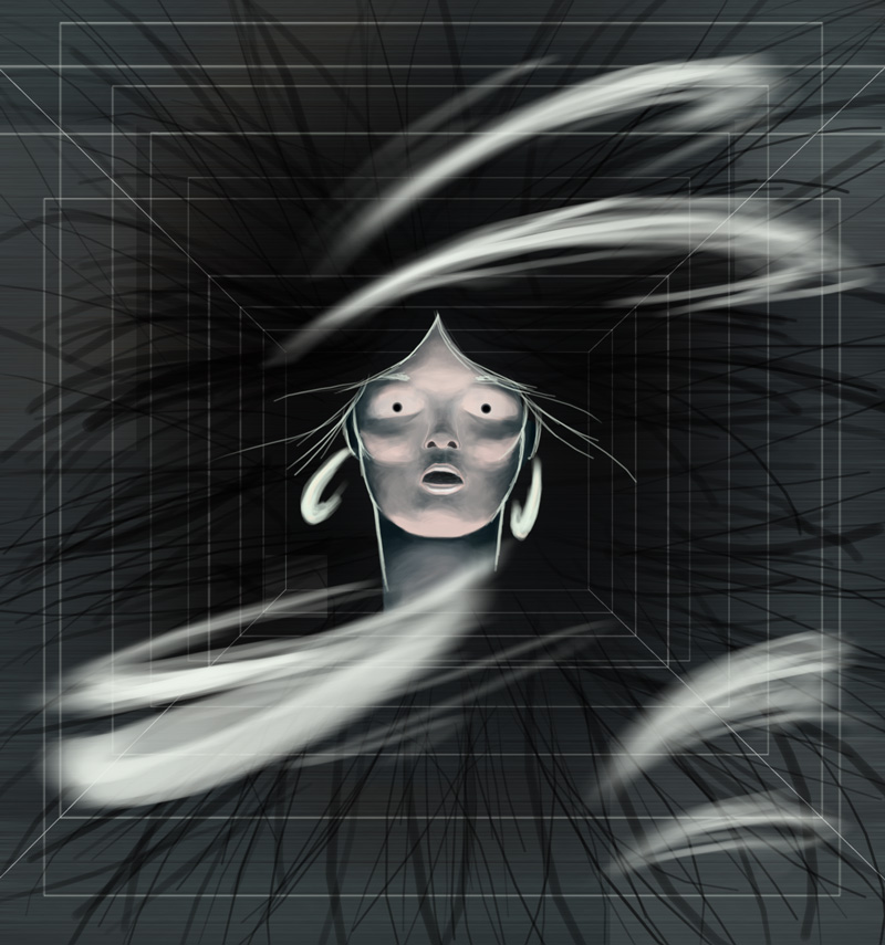
most updated: (yes, she is still in a box)

critique welcome
thks |
|
| Back to top |
|
JaVa-Original
junior member
Member #
Joined: 11 Jun 2002
Posts: 33
Location: USA
|
 Posted: Fri Jul 12, 2002 11:21 pm Posted: Fri Jul 12, 2002 11:21 pm |
 |
 |
Nice work but I really proffered the first one�.just to give an idea of what u could make of it�btw: the proportions are right �u have to remember that the hands are closer to viewer than the face...keep-up the good work 

[ July 12, 2002: Message edited by: JaVa-Original ] |
|
| Back to top |
|
|


