| View previous topic :: View next topic |
| Author |
Topic : "making a futuristic city look real (Finalized?)" |
pixtur
member
Member #
Joined: 28 Sep 2000
Posts: 93
|
 Posted: Tue Jun 04, 2002 7:54 am Posted: Tue Jun 04, 2002 7:54 am |
 |
 |
FOR THE FINAL VERSION CLICK HERE...
Hi...
I worked some hours on this one... I like the overall-perspective and some of the city-parts and the foreground. But somehow I can't get it look more realisitic. It just looks like a comic.
Any suggustions or overpaints welcome.
Edit:
This is just a preview, so any scribbled brush-strokes will be fixed sooner or later. But before this, I have to get tonal values and color-scheme right. Somehow, the streets, the city and the sky don't really come together. It look some too artificial... 

[ June 12, 2002: Message edited by: pixtur ] |
|
| Back to top |
|
Godwin
member
Member #
Joined: 24 Apr 2002
Posts: 701
Location: Singapore
|
| Posted: Tue Jun 04, 2002 8:29 am |
|
|
nice, the tunnels and most of the stuff look real enough, i think theres something wrong with the sky, and try to finish it up better, coz there're blobs of grey here and there standing out from the whole thing
im not experienced at this, but u should try looking at photos of cities like hong kong, NY, the larger metropolitian cities and see how the lights and stuff look |
|
| Back to top |
|
merlyns
member
Member #
Joined: 30 May 2002
Posts: 524
Location: the netherlands -_-
|
| Posted: Tue Jun 04, 2002 8:44 am |
|
|
well this is not my area of cging so I can't give you some helpful crit but I can give you some compliments first your brush handeling is very simpel but It doesn�t show so much in the picture in the ful rez it does but that' a very good thing.
second your lightning is very warm it gives you a relaxing feeling. very nice art you have there 
-david
[ June 04, 2002: Message edited by: merlyns ] |
|
| Back to top |
|
Kari Christensen
member
Member #
Joined: 05 Jun 2001
Posts: 192
Location: Rhode Island, USA
|
| Posted: Tue Jun 04, 2002 10:21 am |
|
|
| Cool! Your lighting and perspective is really nice. Some areas, especially the sky, are really grey when there should be some color from the city lights on them. Also some of the brush strokes are so organic they lose the illusion of architecture. Man, I wish I could paint backgrounds that cool. |
|
| Back to top |
|
kaylon
member
Member #
Joined: 08 Nov 2000
Posts: 128
Location: Dundee, Scotland
|
| Posted: Tue Jun 04, 2002 1:05 pm |
|
|
Did a quick paint over...Now..mine looks no more photo real then yours  ...but, I think the prob with the orig is that the main focus part of the city is the same level of detail as the roads right at the front of the pic. ...but, I think the prob with the orig is that the main focus part of the city is the same level of detail as the roads right at the front of the pic.
If you "blur" or tone them down a bit and pic out some building shaps I think it will help. Also maybe add some finer detail into the forground.
Hope my bad try to explain what im thinking helps hehe. .
Kay. |
|
| Back to top |
|
pixtur
member
Member #
Joined: 28 Sep 2000
Posts: 93
|
| Posted: Tue Jun 04, 2002 3:57 pm |
|
|
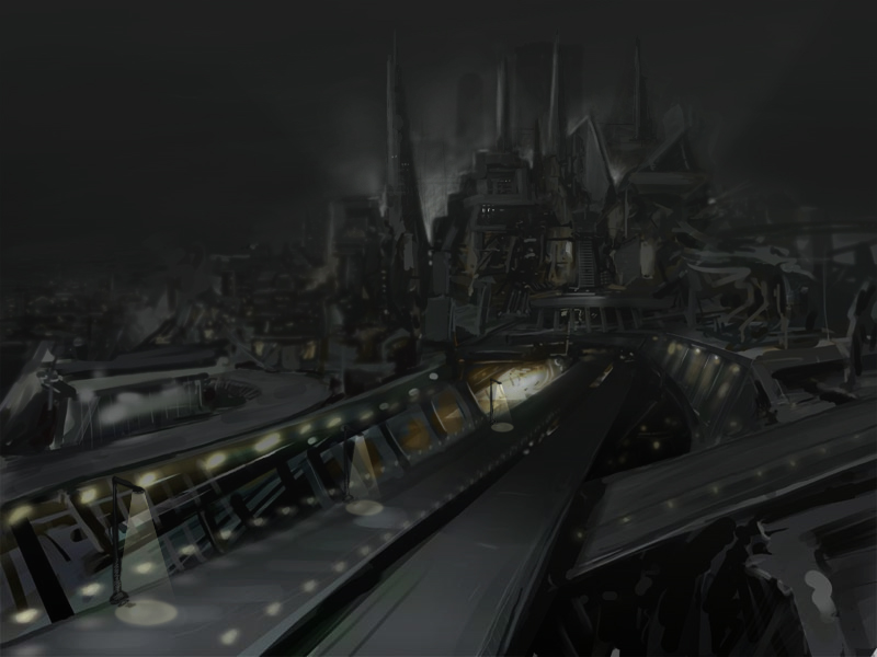
Godwin: All you say is true. The sky is really a pain in the ass, but I am not the best "sky-painter". I try to do some painting without photoreferences, so I don't really want to look at photos right now. I can copy fotos quite well but I dream about getting it right from imagination
Merlyns: Thank you! I still have problems controlling my brush-strokes, esp. long straight lines are a big problem. I will train that more.
Kari Christensen: I tried to fix the sky a little bit, but it's still the worst part of the image.
Kaylon: Yes, level of detail! I always try to learn more about concentrating "interessting" information where I want the people to look at. But I am still very weak at this. Your paintover is great and very clear. Thank you!!! I tried to fade the tonal values at the city and sky, like you did.
Originally I wanted the image of a very chaotic city which is living 24 hours a day. The sun should get up in the background, but you still see the "artificial" lights illumination the deep centers. It's a little bit inspired of William Gibson's "Neuromancer" in which the city is called "sprawl".
Here is the update after two more hours:
 |
|
| Back to top |
|
saladbowl
member
Member #
Joined: 15 Mar 2002
Posts: 249
Location: PA, USA
|
| Posted: Tue Jun 04, 2002 5:30 pm |
|
|
A lot better in my opinion...
If you made that a lil darker (maybe just the sky...) it would be kick ass!
Damn...I need a Tablet!!!
|
|
| Back to top |
|
Lunatique
member
Member #
Joined: 27 Jan 2001
Posts: 3303
Location: Lincoln, California
|
| Posted: Tue Jun 04, 2002 8:10 pm |
|
|
| You should probably make the center of the city less illuminated. It's got a big white light illuminating the center right now, which is also affecting the sky. That's what's making it look artificial. |
|
| Back to top |
|
pixtur
member
Member #
Joined: 28 Sep 2000
Posts: 93
|
| Posted: Wed Jun 05, 2002 3:15 pm |
|
|
3rd update:
- used some construction-lines to fix problems with the horizonline. Adjusted sky and some of the roads.
- changed to format a little bit

[ June 05, 2002: Message edited by: pixtur ] |
|
| Back to top |
|
Rogelio Olguin
member
Member #
Joined: 19 Apr 2002
Posts: 77
|
| Posted: Wed Jun 05, 2002 4:12 pm |
|
|
This city is wierd you have no idea how mcuh roads it has... it is confusing like hell.. I mean talk about a cramped city...
Btw looks very awesome so far...
I think the new format looks better now...
I think what confuses me the most of this work is that you have a lot of bright highlights in many places i mean the city is filled with them so your eye kinda moves around everywhere... Which could be a good thing... Reminds me when I am about to enter new york and even though the orginzation of the buildings are rather well setup in that city it feels confusing when looking at it far away..... from one of the bridges looking into the city.. so it is not bad thing..... large cities are confusing lol... |
|
| Back to top |
|
merlyns
member
Member #
Joined: 30 May 2002
Posts: 524
Location: the netherlands -_-
|
| Posted: Thu Jun 06, 2002 5:20 am |
|
|
oooooooh very nice last time I saw it it was very paintish I liked that one to but this one is far better,I liked the light in the second picture but this one is far more reallistic good work pixtur
-david |
|
| Back to top |
|
mythwarden
member
Member #
Joined: 27 Feb 2002
Posts: 124
|
| Posted: Thu Jun 06, 2002 2:52 pm |
|
|
Very nice work pixtur.
I didn't through all the comments so forgive me if this is already said.
Suggestions:
Try spreading your light out from the center of the city through an array of pinpoint lights. The closer they come to you the more distant and further apart they become. Think of it like a runny egg yoke.
Another thing -- I like your sky more before, since it set a better mood. It just needed to be refined.
It's rare that the sky would be so neutral though. This may be the style you're looking for. If not, then add a little color to it. Shades of a desaturated blue that fade to a warm orange above the city might work. Most of the time low clouds reflect the mass lighting below.
Another thing, once you have the color of your sky...the city will carry a bit of the color within it--Specially the shadows.
Hope this helps.
-myth |
|
| Back to top |
|
pixtur
member
Member #
Joined: 28 Sep 2000
Posts: 93
|
| Posted: Fri Jun 07, 2002 5:28 am |
|
|
Rogelio Olguin: You are right: Everything is quite choatic. What bothers me most it the unbalanced level of detail: There you be large blocks (buildings) and small one, but when I add detail somewhere, it only looks like scattered dirt..
merlyns: I keep going.
Mythwarden: Concentrating small lights at the city is a very good idea but what is a "runny egg yoke" (my English is not good enough)?
The new sky looks not very "moodish" but until I learn how to draw realistic clouds the new one will do. There is allways a next drawing. But addings some colors to the sky helped a lot. Thank you for the hint.
Here is a newer version. Added some structures to the foreground...

fullres_version |
|
| Back to top |
|
merlyns
member
Member #
Joined: 30 May 2002
Posts: 524
Location: the netherlands -_-
|
| Posted: Fri Jun 07, 2002 5:57 am |
|
|
I apsolutly love the new building in front wow it gets better all the time.
-david |
|
| Back to top |
|
mythwarden
member
Member #
Joined: 27 Feb 2002
Posts: 124
|
| Posted: Fri Jun 07, 2002 11:58 pm |
|
|
pixter-
You speak English better then I do my friend. It's just a weird analogy.
An egg yoke is the center of an egg. The yellow part. Crack it and fry it...then break it slightly and it will ooze a little.
Build up your lights not through a big blob of white...or yellow. Build it up through a gradient of tiny lights that mass up to the center point of the city -- Like a yoke. The colors would shift from orange closest to you...to light orange...yellow...light yellow...to white or whatever your lightest color is for that light.
The lights don’t have to be orange in their darkest form. But they should still get warmer the more they mass.
Also:
The more distant things become the less saturation and contrast. The air particles disrupt the path of light. The further they things get...the more they blend into the skyline.
For more moods, you would have the transition more dramatic where the city would disappear completely into a fog. The fog might take on the color of the city lights if they're bright but more likely it will take on the colors of the lightest sources of light in the sky.
Sounds confusing, but mess with it some and it will make sense as you go.
-myth |
|
| Back to top |
|
Leo
member
Member #
Joined: 24 Oct 1999
Posts: 328
Location: Russia
|
| Posted: Sun Jun 09, 2002 7:30 am |
|
|
I did this quite quickly so sorry for the messy quality...

my suggestions are:
- plan before you paint!
- start from big shapes first, then down to details, remember - values are the key.
- paint with light!
- try to say the most with the least.
- look at real world or reference.
-leo |
|
| Back to top |
|
saladbowl
member
Member #
Joined: 15 Mar 2002
Posts: 249
Location: PA, USA
|
| Posted: Sun Jun 09, 2002 7:57 am |
|
|
quote:
Originally posted by Leo:
That is really awsome man!
 |
|
| Back to top |
|
sfr
member
Member #
Joined: 21 Dec 1999
Posts: 390
Location: Helsinki, Finland
|
| Posted: Sun Jun 09, 2002 12:53 pm |
|
|
Wow, that's really some astonishing spooging Leo!
I had to compare the original with your overpaint in Photoshop - quite amazing, the changes are indeed relatively "simple" (but well-placed, obviously) although the illusion is completely different, thanks for the fabulous lesson!
Saffron |
|
| Back to top |
|
pixelsoldier
member
Member #
Joined: 18 Dec 1999
Posts: 728
Location: Ontario
|
| Posted: Sun Jun 09, 2002 3:57 pm |
|
|
Wow, one of the best things I've seen all month long. Awesome job, Leo!
It reminds me very much of Final Fantasy with the palette you used. I'm still drooling. |
|
| Back to top |
|
pixtur
member
Member #
Joined: 28 Sep 2000
Posts: 93
|
| Posted: Mon Jun 10, 2002 3:28 am |
|
|
That's wonderful, Leo! Oh jesus - I still have sooo much to learn. Really impressive overpaint, allthought the changes are not that "simple":
First of all, I've got the perspective completely wrong: The buildings in the background don't need to be drawn tall -- placing them smaller far in the background makes them much higher.
The impression of your colorscheme is much more realistic. I have stayed too much in monochrome.
Thanks again! Like saffron said: A very good lesson. I already did major changes on myself, but I worked on the wrong places...
Sijun is a really great school, if people teach each other that way.
Let's see how the final images turns out. |
|
| Back to top |
|
gArGOyLe^
member
Member #
Joined: 11 Jan 2002
Posts: 454
Location: USA
|
| Posted: Mon Jun 10, 2002 3:49 am |
|
|
| wow.. awesome |
|
| Back to top |
|
merlyns
member
Member #
Joined: 30 May 2002
Posts: 524
Location: the netherlands -_-
|
| Posted: Mon Jun 10, 2002 4:59 am |
|
|
that's a wonderful overpaint leo it reminds me to of final fantasy the spirits withing nice indeed.
-david |
|
| Back to top |
|
pixtur
member
Member #
Joined: 28 Sep 2000
Posts: 93
|
| Posted: Mon Jun 10, 2002 5:49 am |
|
|
This is going to be my final version. Maybe I will add some detail later, but this won't solve much.
I really learnt alot on this image. Again I would like thank everybody for the support! Esp. kaylon and leo for their overpaints. What a great way to learn!! Although its a little bit frustrating if overpaints have a quality that is so far behind my horizon.

this one is a funny version, in which I accidently turned off my citylayer. The overpaints look quite interesting on the background. Though I post it too...
 |
|
| Back to top |
|
Sukhoi
member
Member #
Joined: 15 Jul 2001
Posts: 1074
Location: CPH / Denmark
|
| Posted: Mon Jun 10, 2002 2:27 pm |
|
|
Good job Pixtur! You've come a long way since the beginning of this thread I think!
Or at least the painting look good! 
Sukhoi |
|
| Back to top |
|
DeathJester
member
Member #
Joined: 17 Dec 2001
Posts: 91
Location: Monterey, CA
|
| Posted: Mon Jun 10, 2002 2:35 pm |
|
|
| Nice work man, keep it up... you are deffinitly improving... |
|
| Back to top |
|
lowlight
junior member
Member #
Joined: 27 Mar 2002
Posts: 31
|
| Posted: Wed Jun 12, 2002 7:24 am |
|
|
| I personally liked the one with the sunset-like area to the far right of the structures. However, if you were too keep that particular one, I would suggest also transferring some of that light to the right sides of the surrounding buildings...just something i would do, but it looked really good to me nonetheless. |
|
| Back to top |
|
Mangled Alecto
member
Member #
Joined: 04 May 2002
Posts: 54
Location: ON, Canada
|
| Posted: Wed Jun 12, 2002 10:59 pm |
|
|
leo thats a fantastic remodel of pixturs originally fantastic piece !
lol pixtur
i really like that layer messup version with the city floating
its cool ! |
|
| Back to top |
|
Godwin
member
Member #
Joined: 24 Apr 2002
Posts: 701
Location: Singapore
|
| Posted: Wed Jun 12, 2002 11:04 pm |
|
|
man that last version is a huge improvment since that first pic, nice job, but i think the horizon(in the centre) needs work
and leo's version simply blew me away |
|
| Back to top |
|
|


