| View previous topic :: View next topic |
| Author |
Topic : "holy warrior" |
nil900
member
Member #
Joined: 19 Sep 2000
Posts: 248
Location: Hamburg, Germany
|
 Posted: Fri Oct 19, 2001 1:17 pm Posted: Fri Oct 19, 2001 1:17 pm |
 |
 |
This one is a colour test again. A quick sketch to try to improve my colours. It doesn't look that bad at the moment but I'm not sure if this one is worth finishing.
Any opinions?
http://www.nil900.freeservers.com/Mnch.jpg
[ October 20, 2001: Message edited by: nil900 ] |
|
| Back to top |
|
K-RuzH
junior member
Member #
Joined: 10 Jun 2001
Posts: 40
Location: Stockholm, Sweden
|
| Posted: Fri Oct 19, 2001 2:20 pm |
|
|
im pretty lousy with colors my self but i think this looks nice..
give us updates  |
|
| Back to top |
|
nil900
member
Member #
Joined: 19 Sep 2000
Posts: 248
Location: Hamburg, Germany
|
| Posted: Fri Oct 19, 2001 4:01 pm |
|
|
Thank you K-RuzH! Here is the first update:
 |
|
| Back to top |
|
Dryfire
member
Member #
Joined: 21 May 2000
Posts: 945
Location: Long Island, NY
|
| Posted: Fri Oct 19, 2001 4:03 pm |
|
|
| Looks great man, you should keep on it |
|
| Back to top |
|
Anthony
member
Member #
Joined: 13 Apr 2000
Posts: 1577
Location: Winter Park, FLA
|
| Posted: Fri Oct 19, 2001 5:20 pm |
|
|
| Looks good so far. Is that the short KwanDo he's holding? The lighting seems a little inconsistent-might wanna double check it, make sure all the shadows are right, etc. Shove the key 45 degrees off to one side, probably our left. Swap the background and back lights to our right. Stick a little fill on forground right and you should get some nicer lighting. Right now it's kinda like a camera top light, which is only used in Cops shows or live reporting. Try to get some more color variation in there-it's good right now, but that would help. Overall great work, keep pluggin away! |
|
| Back to top |
|
nil900
member
Member #
Joined: 19 Sep 2000
Posts: 248
Location: Hamburg, Germany
|
| Posted: Sat Oct 20, 2001 12:27 am |
|
|
Thank you anthony for writing crits to both of my recent pics. I'll just answer in this post cause I stoped working on the other one at the moment but I'll keep the things you wrote about that hot metall thing in my mind.
I have to say that I don't understand the most important part of the things you wrote in this post. I did understand that I should mirror the background but I don't know why I should do this. Do you think it would look more dramatic?
I understood that cameralight thing (I'm really happy though if I get this pic looking like a good camera light scene  ) )
What does this mean:
quote
| Quote: |
| Shove the key 45 degrees off to one side, probably our left. |
Please explain if you got some free time
thank you.
Nils
[ October 20, 2001: Message edited by: nil900 ] |
|
| Back to top |
|
nil900
member
Member #
Joined: 19 Sep 2000
Posts: 248
Location: Hamburg, Germany
|
| Posted: Sat Oct 20, 2001 7:45 am |
|
|
This is the next step. I tried to get at least a little bit real looking colours but this is the best I can do at the moment. 
But I keep trying to do better.
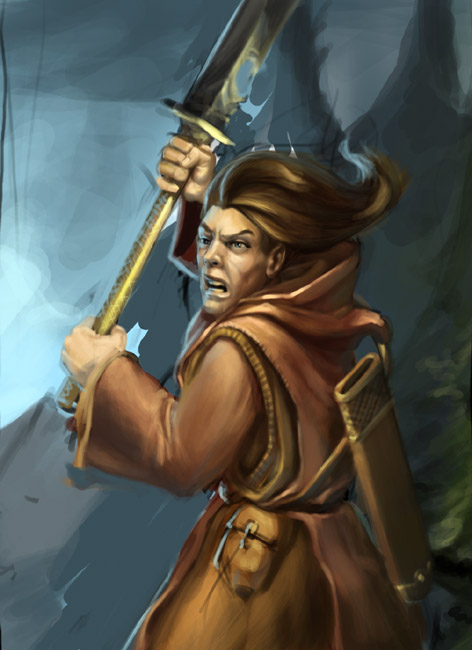
Anthony: I mirrored the backlight but it didn't look good (I just didn't get it right ) |
|
| Back to top |
|
Anthony
member
Member #
Joined: 13 Apr 2000
Posts: 1577
Location: Winter Park, FLA
|
| Posted: Sat Oct 20, 2001 10:09 am |
|
|
| Hey Nil, it's really pretty simple, and almost a suggestion more than a critique. In film we learn the importance of having the back light on the opposite side of the player as the key light(the primary light). The lighting's a touch funky in this pic, cause of the way his face looks a little differently illuminated than his body, which is a little different than his scabbard. If you haven't already, do and think hard on the matte cubes stuff, cause that will really really help you with differentiating the plains of form, and keeping the lighting straight. If we move the key light left, add a medium fill on the right(his left side of his nose and hise left side of his face would be dark then), and then some nice backlight to really catch his flying strands of hair in a glow(that's the main use of a backlight, hair illumination, cause it looks so good!). I wouldn't worry about it in this pic, honestly, cause it's well developed like this, but for future reference it may be a good idea to read a book like Matters of Light and Depth by Ross Lowell, creator of the Lowell light system. Helps with creating beautiful lighting, I've learned a lot from studying stuff like that. Great work, great work! |
|
| Back to top |
|
|


