| View previous topic :: View next topic |
| Author |
Topic : "the edge - next step" |
nil900
member
Member #
Joined: 19 Sep 2000
Posts: 248
Location: Hamburg, Germany
|
 Posted: Mon Oct 01, 2001 5:45 am Posted: Mon Oct 01, 2001 5:45 am |
 |
 |
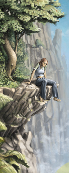
Hi everybody good to see the forum up again.
I posted a few steps of this picture before the forum went down. I didn't have much time to draw recently so this one is still not finished. Please tell me what you think about this step.
If somebody wants to take a look at the past versions I'll post them again.
Oh and I did't get the background looking good, sorry breakerboy (rocks in the background were breakerboys idea) it looks worse than your sketch.
 |
|
| Back to top |
|
VanhoozerArt
member
Member #
Joined: 30 Jul 2001
Posts: 70
Location: Orlando, Fl.
|
| Posted: Mon Oct 01, 2001 5:50 am |
|
|
| Wow...I like it a lot. It does have an unfinished look, but that isn't a bad thing. Very warm colors, nice composition. Maybe some more detail on the rocks behind, but overall very very nice. |
|
| Back to top |
|
silber
member
Member #
Joined: 15 Jul 2000
Posts: 642
Location: Berlin
|
| Posted: Mon Oct 01, 2001 6:25 am |
|
|
the background looks really great especially the rocks in the foreground. 
I wouldn't add detail to the background.
it's good as it is.
only thing to crit is the girl.
The pose seems to be a bit stiff or unnatural...well just a little bit
silber |
|
| Back to top |
|
VanhoozerArt
member
Member #
Joined: 30 Jul 2001
Posts: 70
Location: Orlando, Fl.
|
| Posted: Mon Oct 01, 2001 6:28 am |
|
|
Yeah, I ammend what I said before. I think it is the tree in the foreground that needs a bit of detail. Not the background.
I see clearer now... |
|
| Back to top |
|
faustgfx
member
Member #
Joined: 15 Mar 2000
Posts: 4833
Location: unfortunately, very near you.
|
| Posted: Mon Oct 01, 2001 6:30 am |
|
|
| definitely yes, the tree's hulk is quite neatly and nicely drawn, it really clashes with the fluffy twigs and leafs and shiat. |
|
| Back to top |
|
nil900
member
Member #
Joined: 19 Sep 2000
Posts: 248
Location: Hamburg, Germany
|
| Posted: Mon Oct 01, 2001 7:04 am |
|
|
thank you for your replies. I think that I'll add some more trees and clouds in the background but thats all.
The girl has some serious problems with her arm, the left foot and her necks looks a little broken too. But I'll try to fix these problems this or next evening.
What do you think about the leafs in the foreground should I erase them? |
|
| Back to top |
|
Ian
member
Member #
Joined: 19 Mar 2000
Posts: 1339
Location: Singapore
|
| Posted: Mon Oct 01, 2001 7:10 am |
|
|
| Nice. Try adding a touch more detail to the rocks in the foreground to help pull it out of the background. |
|
| Back to top |
|
Icannon
member
Member #
Joined: 13 Sep 2000
Posts: 597
Location: st.albert, AB, Canada
|
| Posted: Mon Oct 01, 2001 9:34 am |
|
|
| i like how the detail is focused around her. are you going to leave it like that? |
|
| Back to top |
|
KiNgStiNg
member
Member #
Joined: 17 Nov 2000
Posts: 129
Location: Canada
|
| Posted: Mon Oct 01, 2001 9:57 am |
|
|
really nice concept.....
keep working on it....this painting with alot of detail would be really awesome |
|
| Back to top |
|
Petra Pan
member
Member #
Joined: 05 Jun 2001
Posts: 63
Location: Sweden
|
| Posted: Mon Oct 01, 2001 10:04 am |
|
|
I like what I see...
PP |
|
| Back to top |
|
Shiro_tengu
member
Member #
Joined: 02 Aug 2001
Posts: 430
Location: W. Australia
|
| Posted: Mon Oct 01, 2001 10:51 pm |
|
|
| Very nice - I seem to remember that the first problem was that it appeared as if we were looking up at the ledge and down at the girl (or visa versa) You have corrected that well and your image is very nice |
|
| Back to top |
|
CloudNine
junior member
Member #
Joined: 01 Oct 2001
Posts: 6
Location: Great Northwest
|
| Posted: Mon Oct 01, 2001 11:03 pm |
|
|
I agree, I think it's almost fine as is. There is a noticable change of detail from foreground to background, and I think that the "stiff/unnatural" posture lends itself to the fact that the girl is a bit hesitant or cautious about sitting on a ledge thats obviously high high up. Makes me somewhat edgy, while the expression on her face reassures me that its quite a worthy view from there. I like that.
The soft unrefined detail is a style all its own, reminiscent of those old'skewl games like Kings Quest, and those from LucasArts, and that's fine. More realism can be acheived my rendering finer details and playing with lights and value a bit.
Superb composition, nice work. |
|
| Back to top |
|
smaddl
junior member
Member #
Joined: 02 Oct 2001
Posts: 13
|
| Posted: Wed Oct 03, 2001 5:30 am |
|
|
| love your point of view and the inner motion |
|
| Back to top |
|
P diddy
junior member
Member #
Joined: 06 Mar 2001
Posts: 39
Location: oakland, ca, usa
|
| Posted: Thu Oct 04, 2001 5:41 am |
|
|
love the soft painterly look your achieving.
I would suggest adding a some more foregrounding elements. they don't need to be in focus, more dabs of color to separate the different planes.
excellent shading in general, espcially on the pants. |
|
| Back to top |
|
Quasar
member
Member #
Joined: 01 Oct 2001
Posts: 355
|
| Posted: Thu Oct 04, 2001 1:24 pm |
|
|
| Ahhh dont do it....that rocks...lol |
|
| Back to top |
|
|


