| View previous topic :: View next topic |
| Author |
Topic : "girl sitting on the edge of the world" |
nil900
member
Member #
Joined: 19 Sep 2000
Posts: 248
Location: Hamburg, Germany
|
 Posted: Fri Aug 03, 2001 11:30 pm Posted: Fri Aug 03, 2001 11:30 pm |
 |
 |
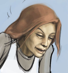
Hi, this is the pic I'm currently working on. I've just spotet some mistakes: the left foot and one ear are wrong and I don't get the hand looking right. But I'll try to get the linework done and then I'll colour it.
I's just a small part of the whole image because I would like to get some crits on her pose, Perhaps you'll find some mistakes I didn't spot. Here it is

please crit. |
|
| Back to top |
|
jr
member
Member #
Joined: 17 Jun 2001
Posts: 1046
Location: nyc
|
| Posted: Fri Aug 03, 2001 11:35 pm |
|
|
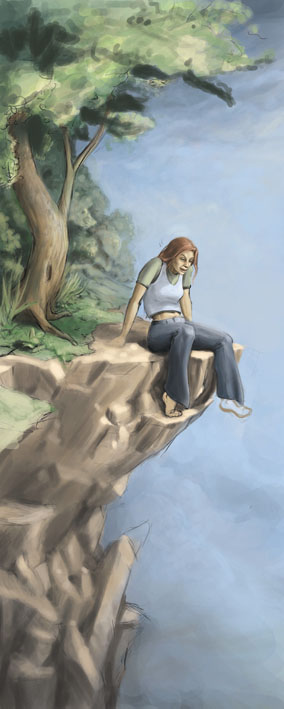
it looks nice, very clean.
the perspective on the girl looks alittle different from the perceptive of the background, it feels like we're looking up at the girl but down at the background. put a line though the drawing and figure out where eye level is and work from that.
i can't wait to see this finished and colored. |
|
| Back to top |
|
nil900
member
Member #
Joined: 19 Sep 2000
Posts: 248
Location: Hamburg, Germany
|
| Posted: Fri Aug 03, 2001 11:48 pm |
|
|
Thank you jr. the perspective was even worse before and I thought I fixed it but you are right I'll have to change that again.
I'll post next step tomorrow after I started colouring. |
|
| Back to top |
|
Probus
member
Member #
Joined: 28 Jul 2001
Posts: 179
Location: Netherlands
|
| Posted: Fri Aug 03, 2001 11:50 pm |
|
|
very cool, luv to see the rest. for the perspective part i�ll go with jr.
Also the left leg looks a bit weird, like it�s bent to the left.
[ August 03, 2001: Message edited by: Probus ] |
|
| Back to top |
|
Laemtao
member
Member #
Joined: 15 Jun 2001
Posts: 129
Location: KayEl, Malaysia
|
| Posted: Sat Aug 04, 2001 2:25 am |
|
|
hi there nil900, Well I thot i'd just put in that i think Jr was spot on about the perspective. At first glance i thot the pic looked great and then something bothered me, and then when i read Jr's comments i realised i couldnt have worded the flaw in the perspective any clearer hehe..
On a brighter note, the girl is looking good.. cept her left leg. It does look like its angled abit awkwardly where her left thigh is. Have to agree with Probus.
---------
Mo |
|
| Back to top |
|
VengerZap
junior member
Member #
Joined: 12 Jul 2001
Posts: 22
Location: UK
|
| Posted: Sat Aug 04, 2001 5:03 am |
|
|
| Yeah the background 'spective and the girl are slightly outta sink which makes it look like the girl is sliding off the cliff. Looks like something special though, I love to see it finished. |
|
| Back to top |
|
nil900
member
Member #
Joined: 19 Sep 2000
Posts: 248
Location: Hamburg, Germany
|
| Posted: Sat Aug 04, 2001 7:41 am |
|
|
Thank you all for your help. I knew that somebody would spot some mistakes, very good  . .
I'll change the perspective problem while colouring the pic. The outlines will be gone then.
I started colouring the image this morning but I'm really doing bad today  . Don't know how to get the right lightsetting and I'm not that sure what the background should look like. I decide just to draw clouds in the bg no land ( just a few trees in the upper left part) for now but I might change that. What do you think. . Don't know how to get the right lightsetting and I'm not that sure what the background should look like. I decide just to draw clouds in the bg no land ( just a few trees in the upper left part) for now but I might change that. What do you think.
Here's the bad next step:

please help me to improve this image. I would be happy if all of you take a look at the next steps, too.
Thank you |
|
| Back to top |
|
KrayZ
member
Member #
Joined: 09 Feb 2001
Posts: 91
Location: UK
|
| Posted: Sat Aug 04, 2001 5:16 pm |
|
|
| Love the way it's turning out. Sorry, no crits from me. It's 2:20am here and I'm about ready for bed. |
|
| Back to top |
|
EviLToYLeT
member
Member #
Joined: 09 Aug 2000
Posts: 1216
Location: CA, USA
|
| Posted: Sat Aug 04, 2001 8:37 pm |
|
|
| Looks great... but for some reason i get this feeling that shes REALLY old. |
|
| Back to top |
|
jcFIG
member
Member #
Joined: 05 Aug 2001
Posts: 189
Location: San Diego, Ca.
|
| Posted: Sun Aug 05, 2001 6:32 am |
|
|
Thats coming along nicely. Great drawing too. You may want to block in your darkest darks and lightest lights before going to the grey tones. Later.

[ August 05, 2001: Message edited by: jcFIG ] |
|
| Back to top |
|
nil900
member
Member #
Joined: 19 Sep 2000
Posts: 248
Location: Hamburg, Germany
|
| Posted: Sun Aug 05, 2001 8:13 am |
|
|
Hi I just came in to post the next colour step. And then I saw that I got new crits so I wasn't able to use them for this step.
I tried to fix the perspective problem but I'm still not that happy with it. I'll work on that later.
EviLToYLeT: You're right she looks really old in the last step. Now she doesn't look that old anymore but the face has a strange expression - don't know why.
jcFIG: you've just spotet the biggest problem which I'm allways angry about. I just start colouring and I don't really know how to start, I don't really know how it works. Thats why I posted the sijun lesson thing, I need to learn how to do a good colouring job .
Thank you for crits.
|
|
| Back to top |
|
jcFIG
member
Member #
Joined: 05 Aug 2001
Posts: 189
Location: San Diego, Ca.
|
| Posted: Sun Aug 05, 2001 8:25 am |
|
|
Well keep doing what you're doing becasue I don't see anything wrong with it. It's looking awesome, I can't wait to see it.-Later.
|
|
| Back to top |
|
nil900
member
Member #
Joined: 19 Sep 2000
Posts: 248
Location: Hamburg, Germany
|
| Posted: Mon Aug 06, 2001 12:51 pm |
|
|
time for the next one:
I worked on nearly every part of this but there is still much more work to do. I tried to add more depth to it and I partly succeeded on the cliff but I'm not very happy about the trees (the one in the front looks like a giant Bonsai Tree) right now but I'll go on. Maybe they'll turn right later.
I didn't manage to get face looking good at this point .
Thank you for not loosing the trust in my skills (cough, cough) jcFIG, and everybody else  . .
Any crits at this point?
[ August 06, 2001: Message edited by: nil900 ]
[ August 06, 2001: Message edited by: nil900 ] |
|
| Back to top |
|
Speve-o-matic
member
Member #
Joined: 25 Jun 2000
Posts: 198
Location: Johannesburg, South Africa
|
| Posted: Mon Aug 06, 2001 1:13 pm |
|
|
Hey nil900. Great image so far.
Aside from the things that have been pointed out, I think the greatest aid in this image would be to give a greater sense of height to the cliff. At the moment, this scene could be 20 metres of the ground, or 2000 metres. . . I don't think it's clear enough yet.
Perhaps you could create a break in the clouds below and show some of the ground peaking through. I just think that the viewer needs to be given more clues as to just how high this cliff is.
- Steve |
|
| Back to top |
|
nil900
member
Member #
Joined: 19 Sep 2000
Posts: 248
Location: Hamburg, Germany
|
| Posted: Mon Aug 06, 2001 1:35 pm |
|
|
Thank you Steve! You are right that would probably push the atmosphere.
The problem is that I wanted the cliff to be the edge of the world so there should be nothing then sky and clouds. I don't know how to solve this. Maybe I should get rid of this edge idea and draw a landscspe??
Isn't there another way get to a better result  |
|
| Back to top |
|
jcFIG
member
Member #
Joined: 05 Aug 2001
Posts: 189
Location: San Diego, Ca.
|
| Posted: Tue Aug 07, 2001 12:16 pm |
|
|
| Wow, I can't wait till you finish this. I am taking Background painting next semester and seeing this just gets me excited for that class. |
|
| Back to top |
|
Shirotsugh
junior member
Member #
Joined: 08 Jun 2001
Posts: 44
Location: Nova Scotia
|
| Posted: Tue Aug 07, 2001 5:02 pm |
|
|
| I don't if the sky is going to be tweaked anyway, but it seems to me that currently, the clouds look like those of either fog or a rainstorm. If it is foggy and such, maybe the background should fade out faster? I dunno, it just seems that the setting doesn't look overly affect by the cloudiness; it looks more like a normal day. |
|
| Back to top |
|
edible snowman
member
Member #
Joined: 12 Sep 2000
Posts: 998
|
| Posted: Tue Aug 07, 2001 6:40 pm |
|
|
| if you want it to be the edge of the world you could try making some part of it fade into the darkness of space. |
|
| Back to top |
|
Breakerboy2
member
Member #
Joined: 02 Aug 2001
Posts: 96
Location: NYC
|
| Posted: Tue Aug 07, 2001 10:20 pm |
|
|
Hi nil900.
I did a quick color sketch of what your image made me think of. Hope you don't mind...

This might not be what you were thinking, but something like this would suggest the edge of the world to me. This would probably work better from a higher "camera" angle, but you've got a good thing going. |
|
| Back to top |
|
nil900
member
Member #
Joined: 19 Sep 2000
Posts: 248
Location: Hamburg, Germany
|
| Posted: Wed Aug 08, 2001 10:12 am |
|
|
Hi I had to work very hard in the last days so I wasn't able to draw and I even didn't have the time to post a reply on your crits.
jcFIG thank you I'm glad you like this one. Is the school you are at an illustration school? I never heard about background classes at the art schools in germany.
Shirotsugh: I wanted daylight (late afternoon ) for this picture and it shouldn't be foggy but I know that it's looking like it, my fault . I'll try to reduce the fog in the next step.
edible snowman: I thought about that before but I feared that the dark space would destroy the pic.But...
Breakerboy2 : Thank you for that overpaint. It's a great idea to add these rocks to the background. I will use it for my background. It means more work to me (I'm really short on time at the moment ) but it will add much to the atmosphere.
... I'll try to merge these two ideas (dark of the space and the additional wall) I think. I don't know if it works but I'll try. The next step will be here in around two days. |
|
| Back to top |
|
|


